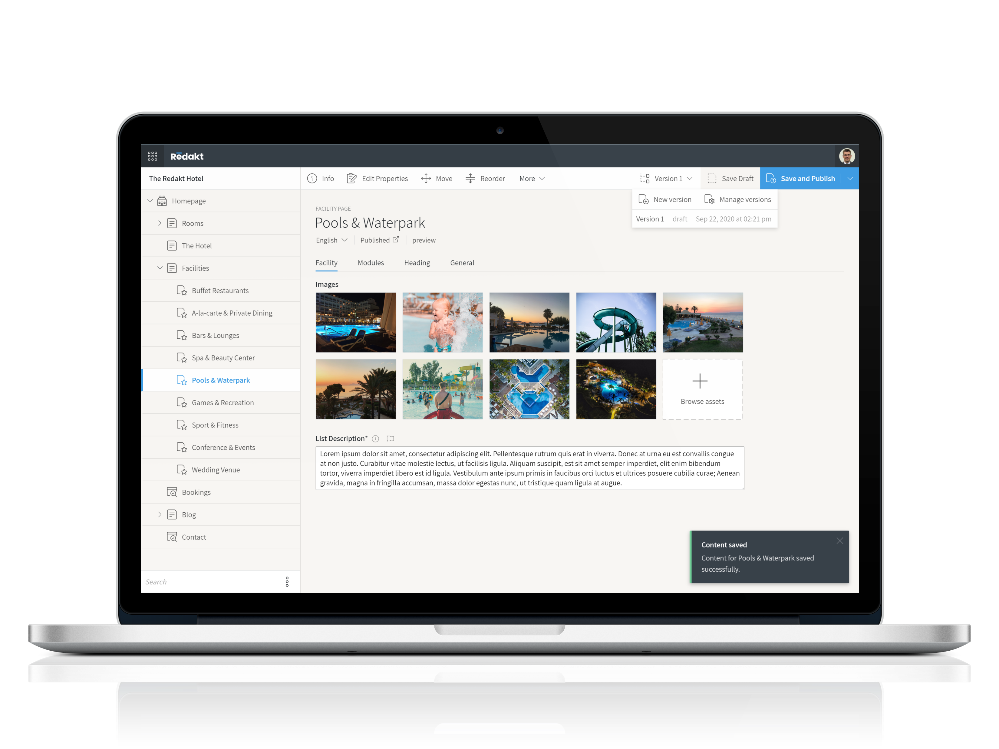
Redakt’s back-office user interface is optimized for content editors, not computer scientists. It's beautiful and intuitive and does not require a steep learning curve.
Many Content Management Systems restrict usability with feature bloat, confusing functions and other interface clutter. The Redakt user interface is intuitive and easy to use for anyone. There is no steep learning curve, so you can be productive from the get-go. Like you've been using it for years.
Main content management tasks are never more than one or two clicks away. Great application responsiveness means you won’t need to wait around looking at spinning wheels. Saving you both time and frustration. Get your job done quickly and go home early!
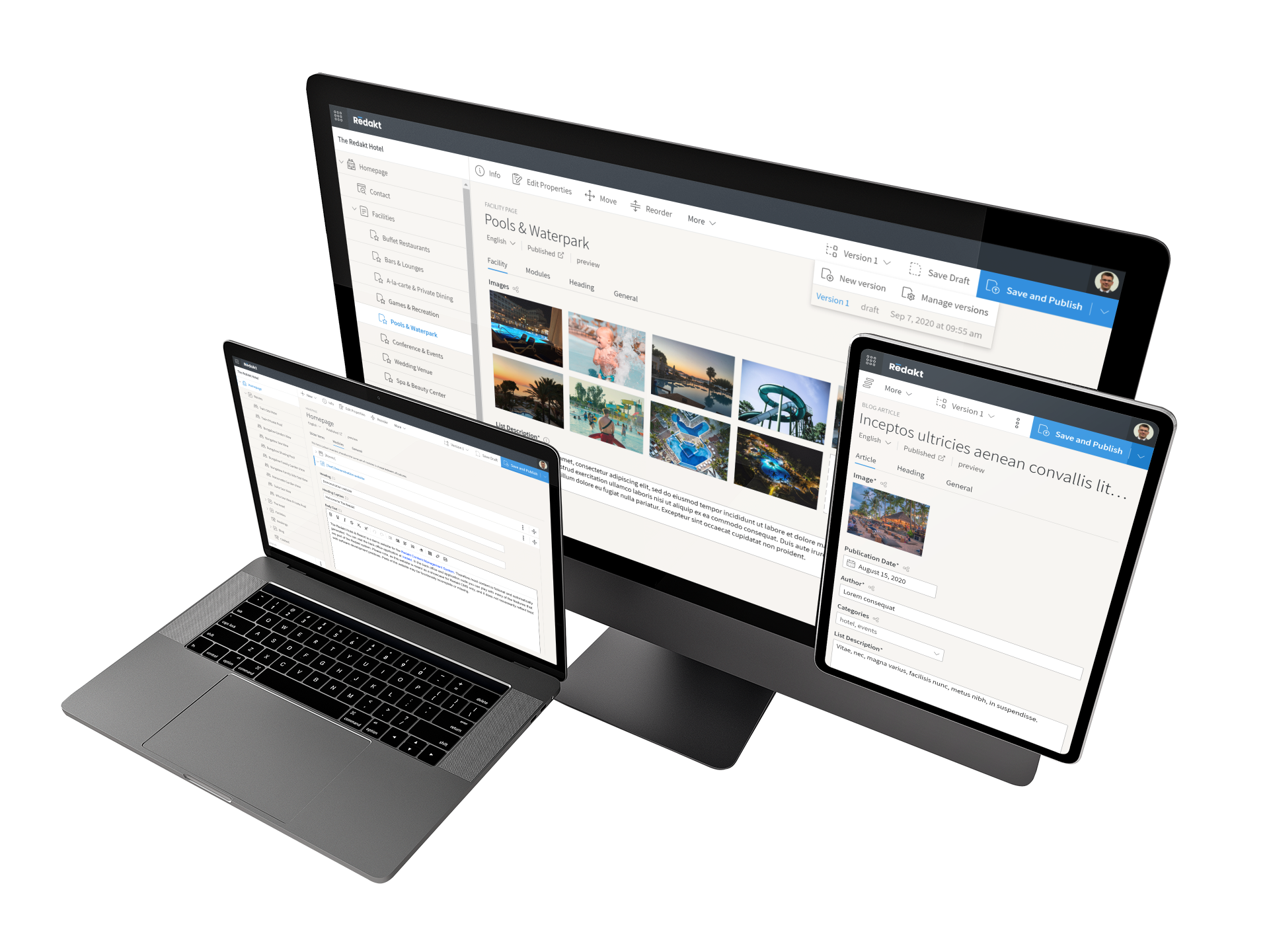
The Redakt back office user interface follows responsive design principles. This means that the interface adapts itself to the size of your device, from large desktop monitors down to small phone screens.
Although the layout of the interface changes with device size, it remains fully functional at all times. Do your main content authoring on your office computer, use your phone to quickly fix that typo you noticed while on the train, and take your tablet to the sofa to catch up on some content reviewing.
Redakt’s back-office user interface is fully customizable. You can easily create a content management experience that works best for you.
Content fields and models can be tailored to your exact requirements, from simple text fields to complex nested content structures and tables. Tooltips and help texts can be added to fields, aiding content managers with tips & guidelines. Organize fields into clear sections, and personalize their layout any way you want.
We've setup a live demo where you can play around with the back office yourself. Why not go there now and see how it works?